


Wallpaper instantly transforms the blank walls of your home into bold and dimensional backdrops. And while we usually celebrate this metamorphosis, for some it can be a source of design anxiety. What if the wallpaper clashes with existing artwork and photography? Will a new backdrop overwhelm and overtake the other decorative pieces?
Fortunately, there are many ways to create a sense of harmony and continuity between your hanging art and your wallpaper. These tips will help you strike a balance between artwork and wallpaper that will elevate both features:
Complementary or Contrasting Color
Color is an incredibly powerful design asset: it not only helps reinforce the tone of your space, but also serves as a bridge between different design elements and your décor. Which means it makes for an excellent mediator between your wallpaper and hanging art.
There are two general approaches for using color to create a balance between your art and your wallpaper: continuity or contrast. You either create unity with common colors or highlight the juxtaposition by using different color schemes.
Susie’s updated utility space is an excellent example of using color continuity to create cohesion between wallpaper and wall art. The black and white prints she layered over the black, abstract graphical wallpaper adds new dimension to the color. Even the art pieces that pull color from other elements in the room, like the earthy pink cabinets, tie into the wallpaper thanks to the black frames.
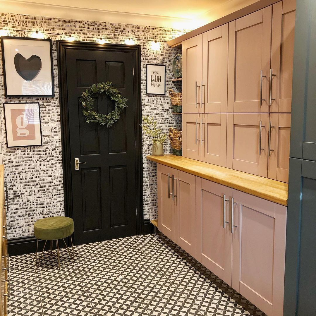 | 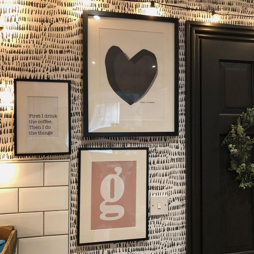 |
| Design and Photography by Susie Levache | |
It’s important to note that your frames can provide enough color continuity to create harmony between your wallpaper and hanging art. So, if there’s a piece you LOVE that you want in your wallpapered room that doesn’t have any color commonality, the framing – and matting – can bridge that color gap.
Conversely, highlighting the difference in color between your wallpaper and hanging art creates a dramatic contrast that maintains – and celebrates - each feature’s unique charms. Unsure what that looks like? Check out interior designer Christine Kohut’s dramatic entryway featuring dark grey, kaleidoscope-esque wallpaper and vibrant, rainbow-hued abstract art:
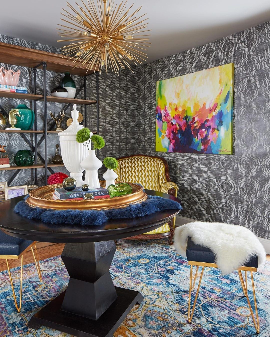 |
| Design and Photography by Christine Kohut |
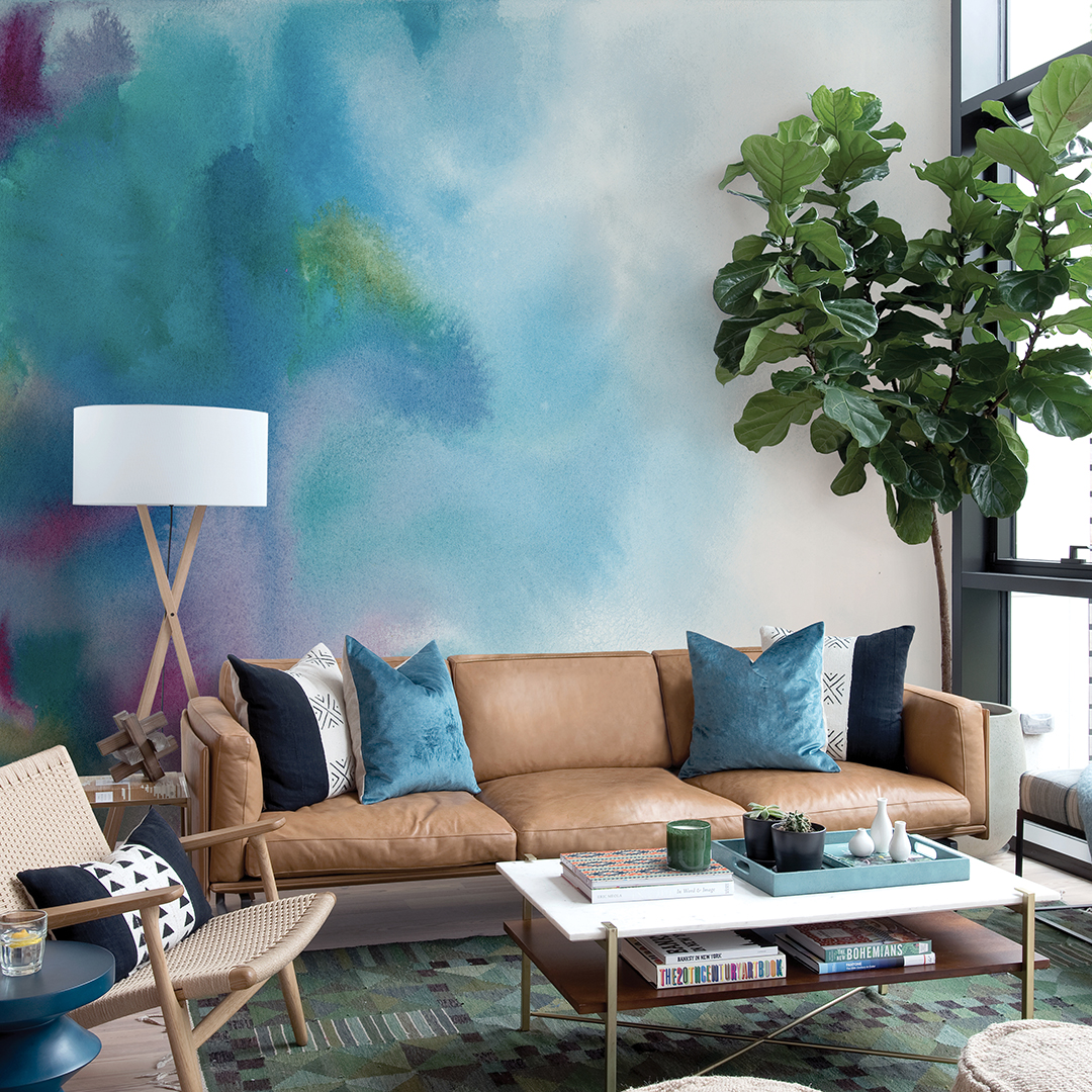
Sometimes, your art might strike a happy medium; a piece that has both coordinating hues and contrasting accent colors succeeds in creating both harmony and distinction between décor and wallpaper. This abstract floral painting both blends and pops against the blue damask wallpaper, thanks to its soft blue hues and splashes of sunny yellow.
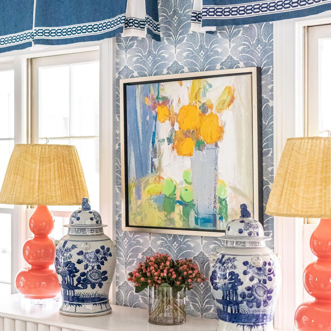 |
| Design and Photography by Kyle Stelling Interiors, Inc. |
Building on Theme
When matching hanging art to wallpaper, you can also play with the style and thematic elements of each to make a compelling pairing. And similarly to color, you can either choose to build upon common themes or create a sharp style contrast.
This bohemian bedroom retreat by Modern Cottage Interior Design Studio is a perfect example of playing up the existing theme. The gorgeous teal medallion wallpaper adds organic, geometric flair to the space – which is further accented by the stunning abstract wall art created by founder and lead designer Michelle Lane! The overall effect of the pairing is stunningly sophisticated yet down to earth.
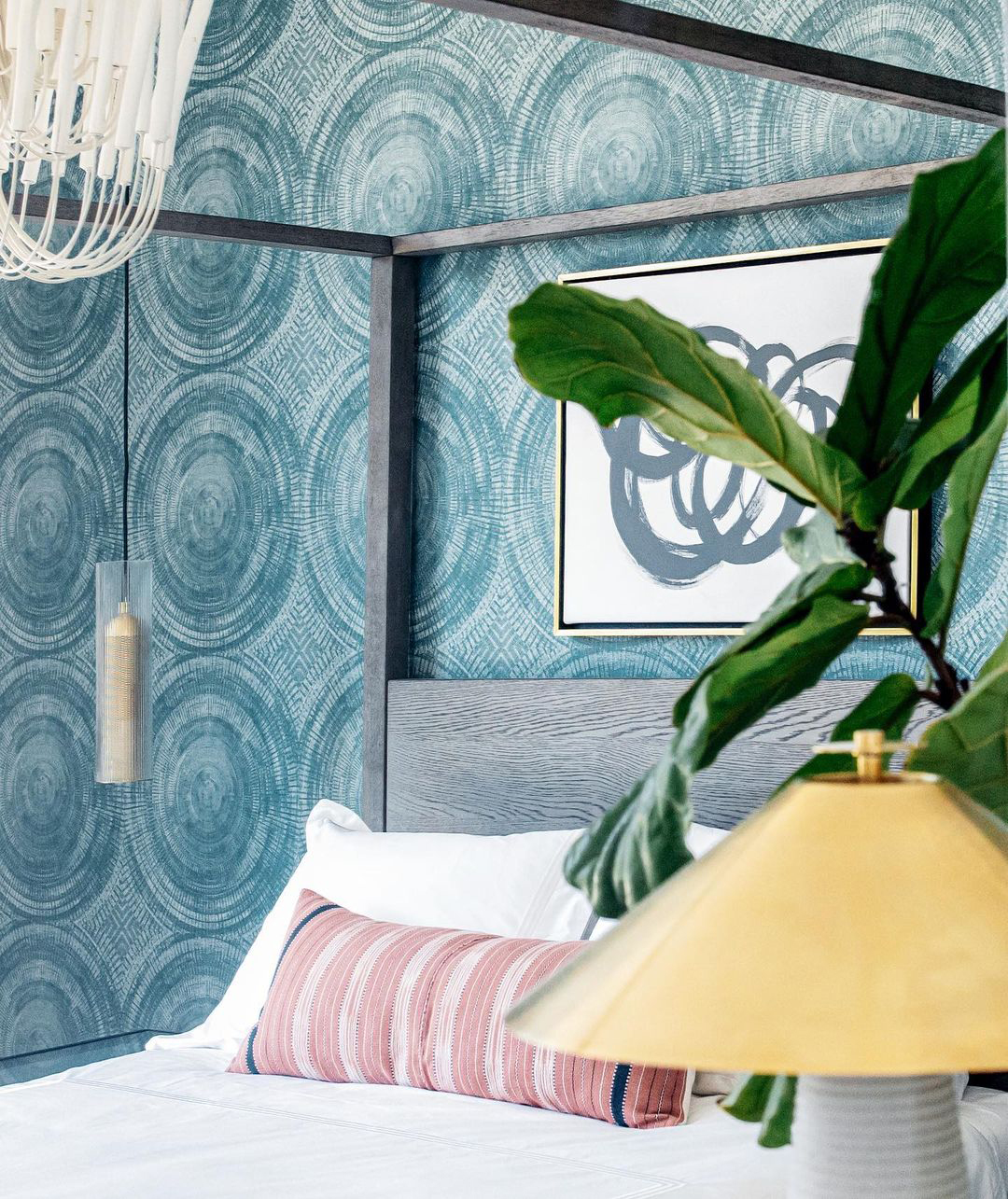 |
Design by Modern Cottage Interior Design Studio |
When upgrading her upstairs hallway, Mel Shaver-Durham chose a dramatic, Art Deco-inspired wallpaper with metallic accents and flock detailing. To match the drama of her backdrop, she added several bold, simplified portraits by artist Margo Mc Daid. The stark, graphical abstraction is an eclectic yet natural complement to the striking graphics of the wallpaper itself.
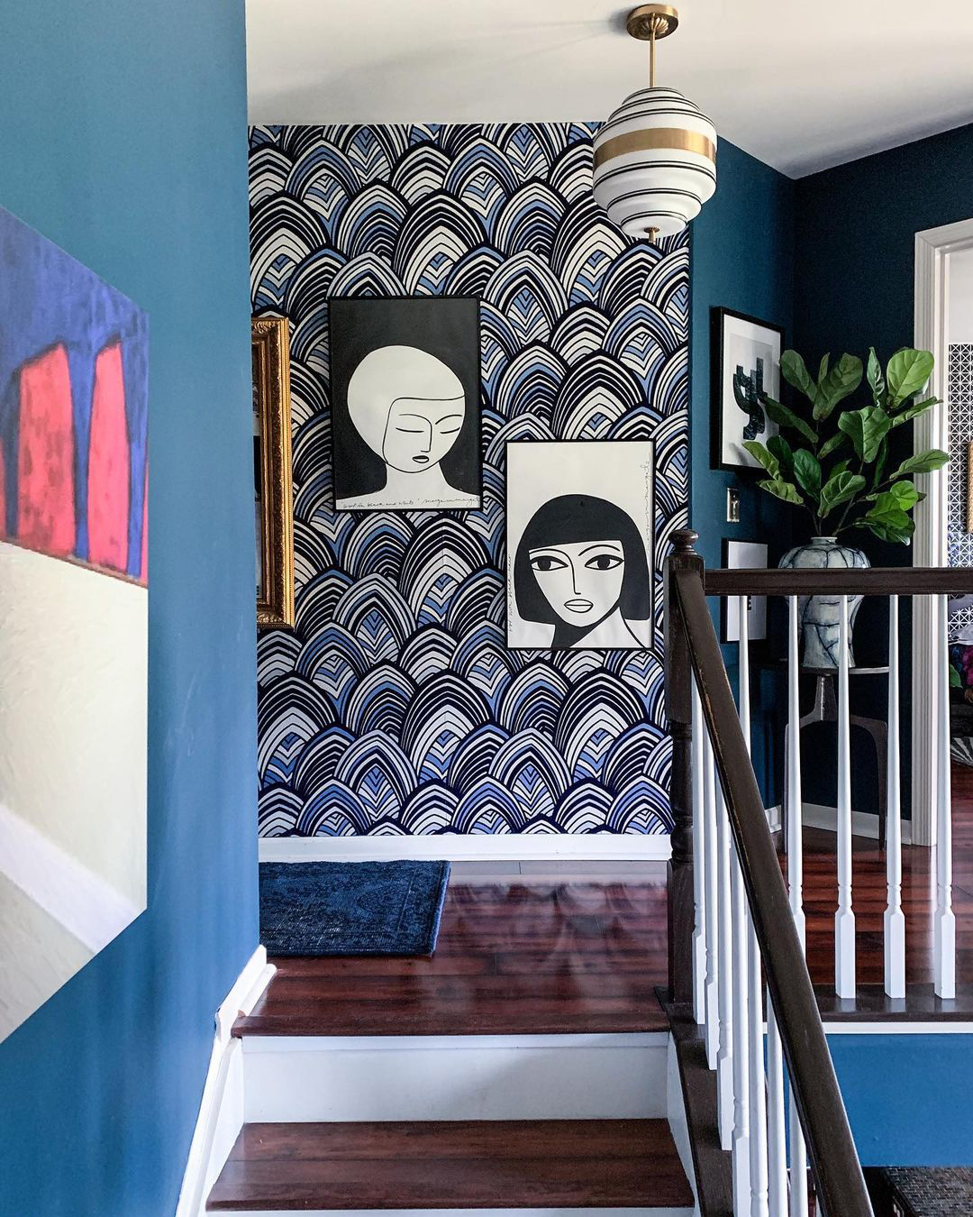 |
| Design and Photography by Mel Shaver-Durham |
While building upon the same styling theme can be easier to conceptualize, playing with thematic contrasts can have some truly incredible results! Take this whimsical, out-of-this-world room Rachel designed for her son. Usually someone would add nautical accents to this chic ocean wave wallpaper; instead, Rachel played with the vastness of both space and the seas with some epic outer space artwork. The astronaut artwork is truly the centerpiece, and the orange inks to the other galactic prints adds another layer of brilliant contrast to the space.
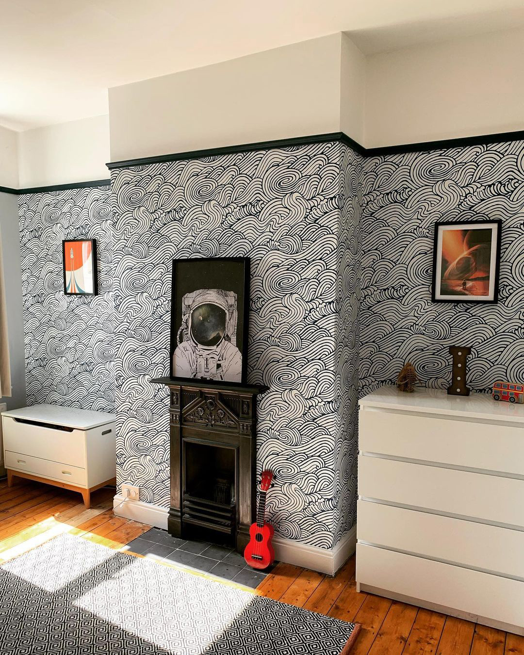 |
| Design and Photography by Rachel @a_step_up_the_ladder |
Wallpaper AS Art
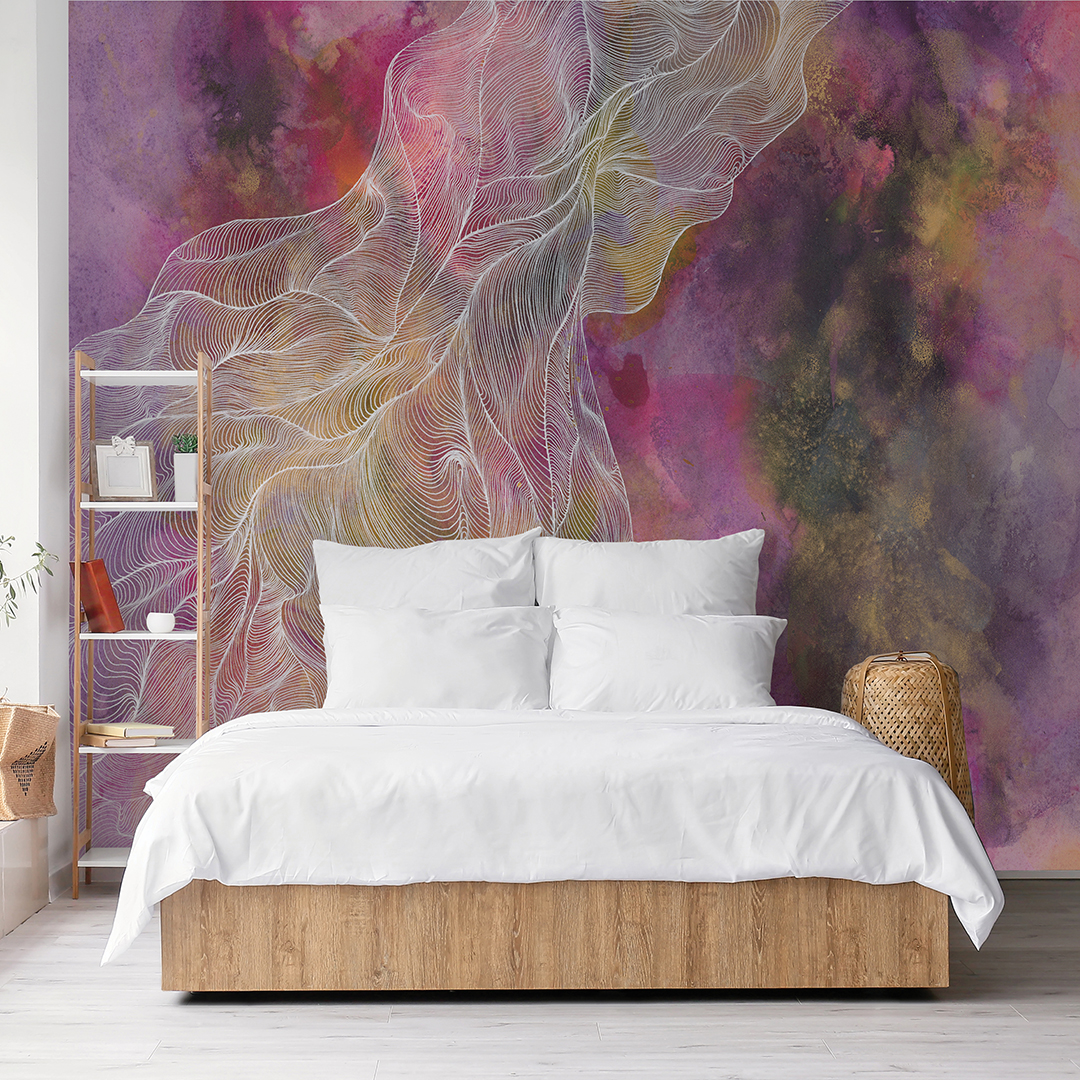
For those who prefer a more simplistic yet high-impact approach to wallpaper and art, consider wallcoverings that ARE fine art. The advancements in modern wallpapering have made it very simple to create high-impact designs that are reminiscent of gallery-worthy compositions. In some instances, these wall coverings are direct adaptions and translations of an artist’s work, like these mural collections that are a sampling of Glenyse Thompson and Karen Revis’ works.
 |  |
| Glenyse Thompson’s vibrant works explore the human connection and the daily interactions many people take for granted. The colorful backgrounds serve as a representation of people, while the hand-drawn linework provides tangibility and connectivity to our speech. Plus, they are simple stunning and bring electrifying energy to your space! | |
 |  |
| Karen Revis is an artist and printmaker by trade, her designs an exploration in color, texture and abstraction. Her murals bring rich sophistication and dimension to your home, giving your space the grandeur of a fine art gallery. | |
Want to get playful with your new artistic wallpaper? Consider hanging empty, ornate frames over a portion of the design: not only will this emphasize the art exceeding any canvas or frame, but it will also add structure to your décor while challenging you to constantly think outside the box with your style!
Looking for more inspiration on bridging the gap between artwork and wallpaper? Follow A-Street Prints on Instagram and Pinterest for ideas and examples!