Over the past couple of years, we have witnessed a significant shift in interior design preferences. Gone are the days when neutral minimalism reigned supreme; here to stay - for the foreseeable future, anyways – are the many facets of bright, bold and personality-packed maximalist style, like cottagecore and grandmillennial glamour.
But what if your style lands somewhere in the middle? How do you balance a love of color and pattern with minimalism’s airy and open design appeal?
Enjoy the best of both worlds with these tips for creating beautifully bold, bright and airy designs:
Keep It Light
One of the easiest ways to create a bright and airy space while using pattern is to keep your color palette light! Soft washed-out hues, or more saturated color balanced with lots of negative space, will keep your overall space feeling open and bright.
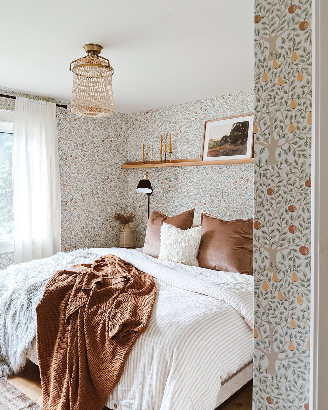
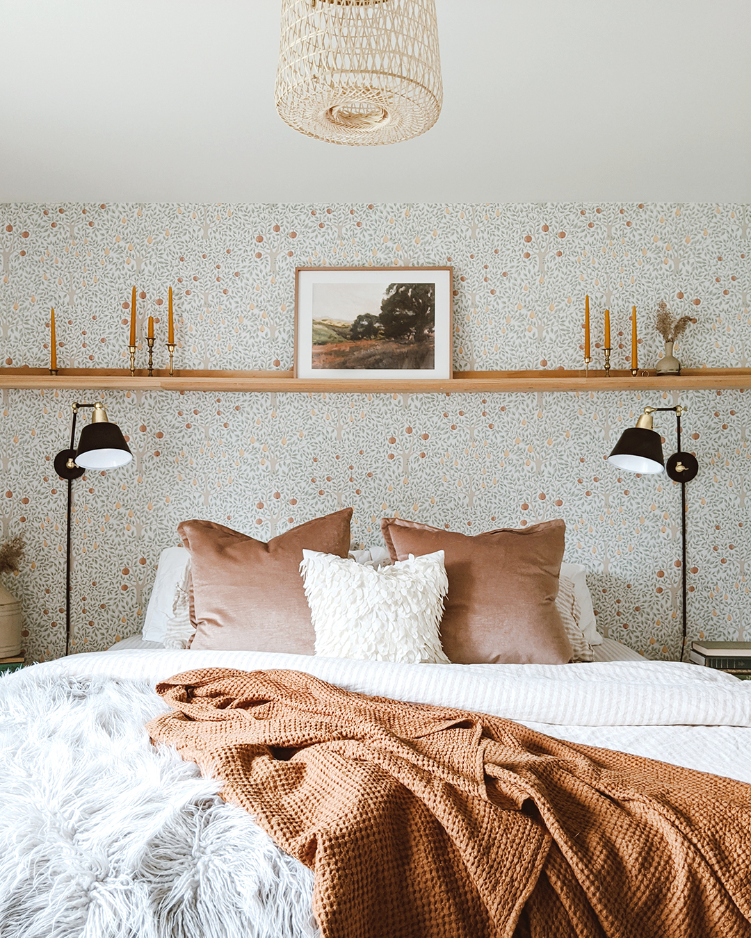
Kirsten Diane’s stunning bedroom is entirely wrapped in wallpaper; the delightfully unexpected fruit tree design brings both earthy sophistication and a touch of whimsy to the space. Yet the room retains an overall airy feel, thanks to the pattern’s soft color palette. If anything, the room is brightened further by the wallpaper’s blend of delicate green, gold and orange hues.
 |  |
| Design and Photography by Kisten Diane | |
Sheer white curtains and plush white striped bedding adds to the room’s feeling of spaciousness, along with natural accents like a gorgeous woven cane chandelier and wooden photo ledge. Rich splashes of ochre adds depth and amplifies the gorgeous, earthy vibes of this charming design.
While equally dreamy and airy, Kate Damich’s eclectic bathroom design is more richly infused with color. The secret to achieving both a colorful design and bright, open interiors? It’s all about balance.
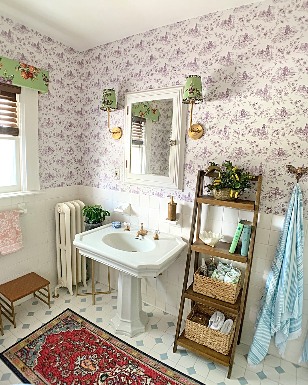
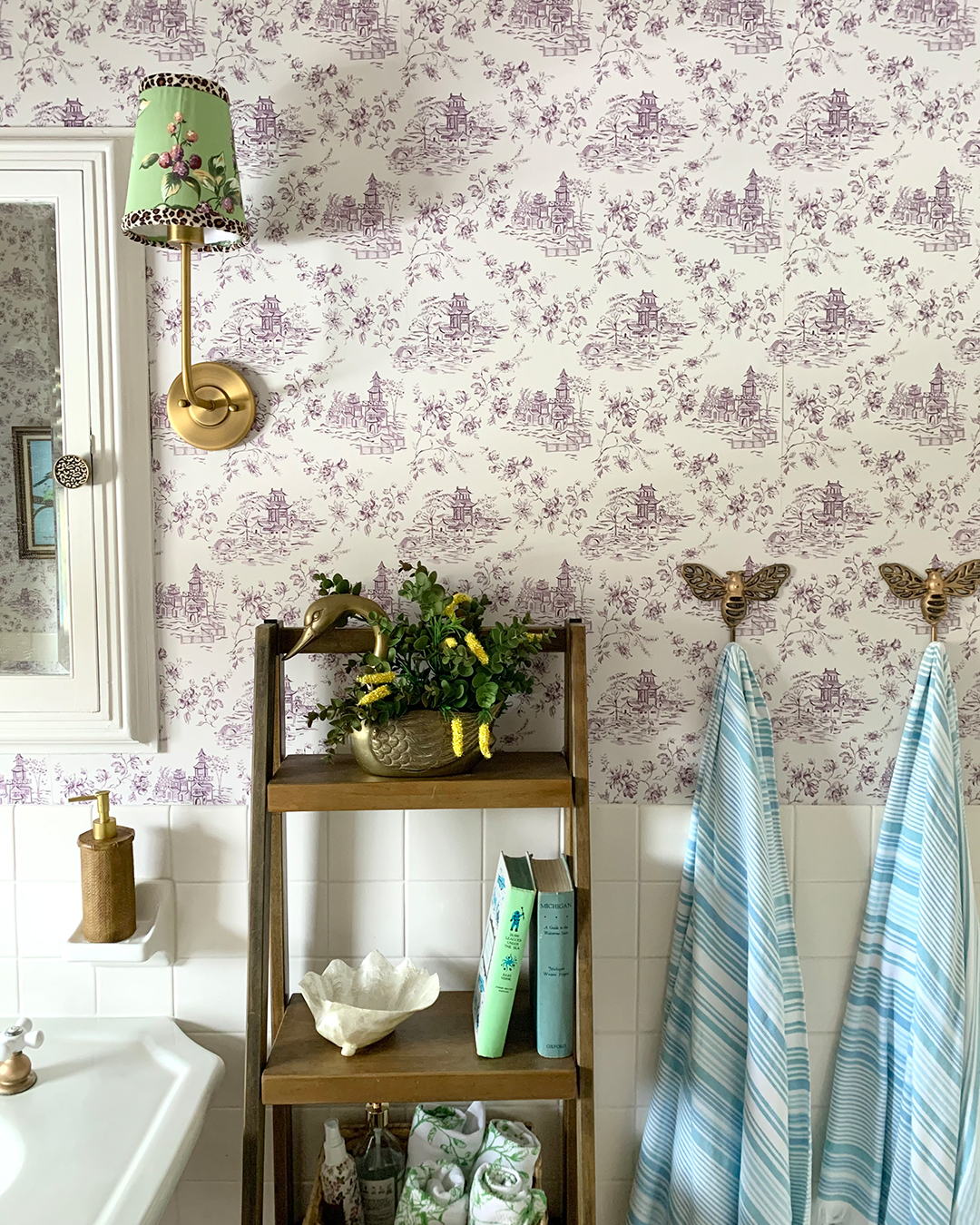
First, Kate chose a charming toile wallpaper with village vignettes inked in rich plum on off-white paper. This balance of negative space and pattern of the focal feature is key to maintaining a bright and airy look – along with the half-wall of white tile that wraps her bathroom.
 |  |
| Design and Photography by Kate Damich | |
You’ll notice too that while Kate brought in a wide array of colors, they all coordinate with some other element in her bathroom. The green fruit fabric of the sconces and window treatment features purple berries that tie back to the wallpaper. The blue striped towels match the blue tiling on her floor, and the vintage red rug – with its pops of pale blue and apricot – jives with every other element in the space. It’s an eclectic and lively mix that remains light and bright thanks to its color cohesion.
Simplify your Color Scheme
Another great way to achieve airy interiors, especially if you like richer colors and bolder patterns, is to keep your color palette tight. Stick to one main color, accented by no more than two complimentary colors of the same general tone. This helps keep even larger scale, more elaborate patterns feeling light and your interiors open.
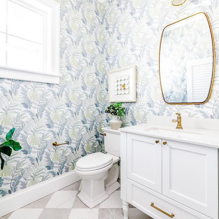
This charming coastal bathroom, built and designed by Dan and Emily Clark, is a great example of how a restricted color palette can balance bolder patterns to maintain open and airy design. Despite its larger scale, the soothing tropical palm wallpaper makes the space feel bigger thanks to a subtle blend of grey, slate and sage. Grey and white-checkerboard tiling amplifies this sense of space, while white fixtures and golden accents add to its charm and brightness.
 |
| Design, Build and Photography by Clark and Co Homes |
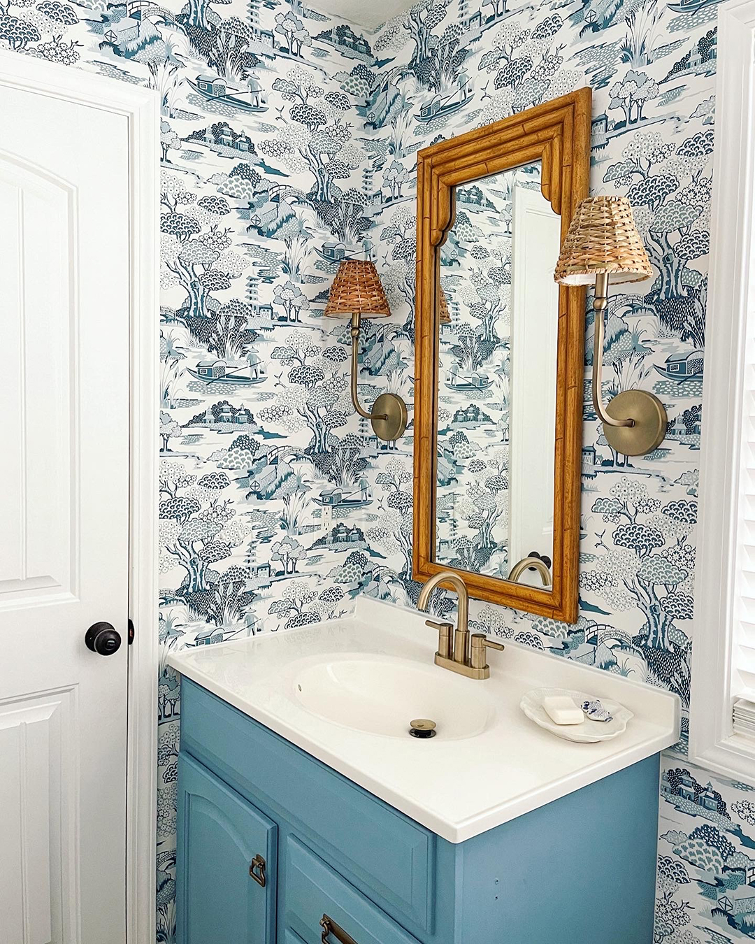
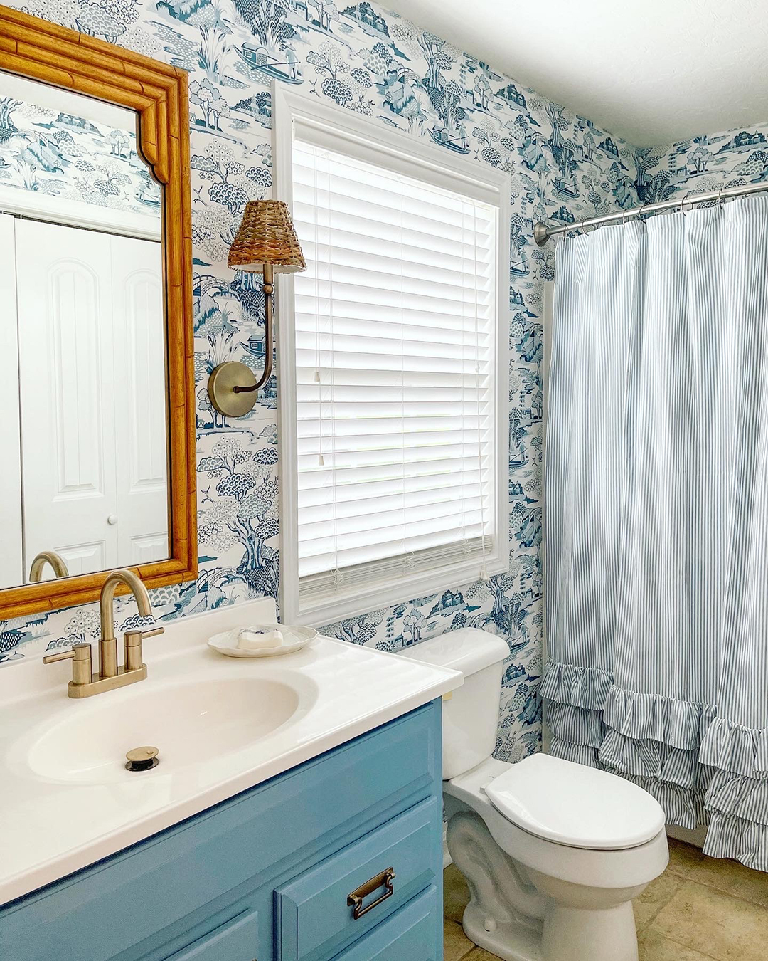
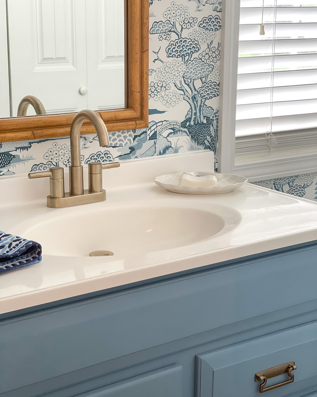
Too much color could have easily overwhelmed this gorgeous toile bathroom design by Courtney Wafzig. By sticking to the shades of blue and white in the wallpaper, Courtney kept the space from feeling bogged down by too many competing hues. Instead, the continuity of color and simple ticking stripe shower curtain allows the toile wallpaper to truly shine, drawing your eye throughout the room and widening the space.
 |  |  |
| Design and Photography by Courtney Wafzig | ||
Balance Bold Color with Simple Patterns
Good news for maximalists who love big, bold color: open and airy interiors are still attainable! The key is to balance those power-packed hues with simple patterns featuring lots of negative space.
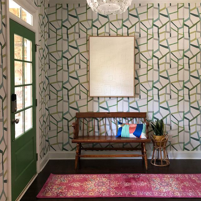
Take this electrifying entryway from interior designer Gina Sims. The green and fuchsia combo is delightfully vibrant, yet never overwhelming thanks to ample negative space throughout the design. The funky green geometrics of the wallpaper are softened by off-white segments that offer relief while also enhancing the movement of the design. The textural all-white art piece further adds to this relief, while the entire space is grounded by rich tones of the antique bench and wood flooring.
 |
| Design and Photography by Interior Designer Gina Sims |
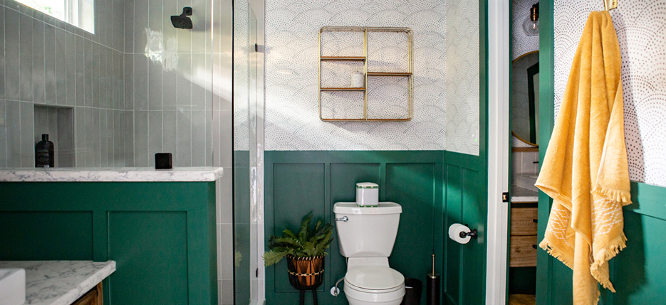
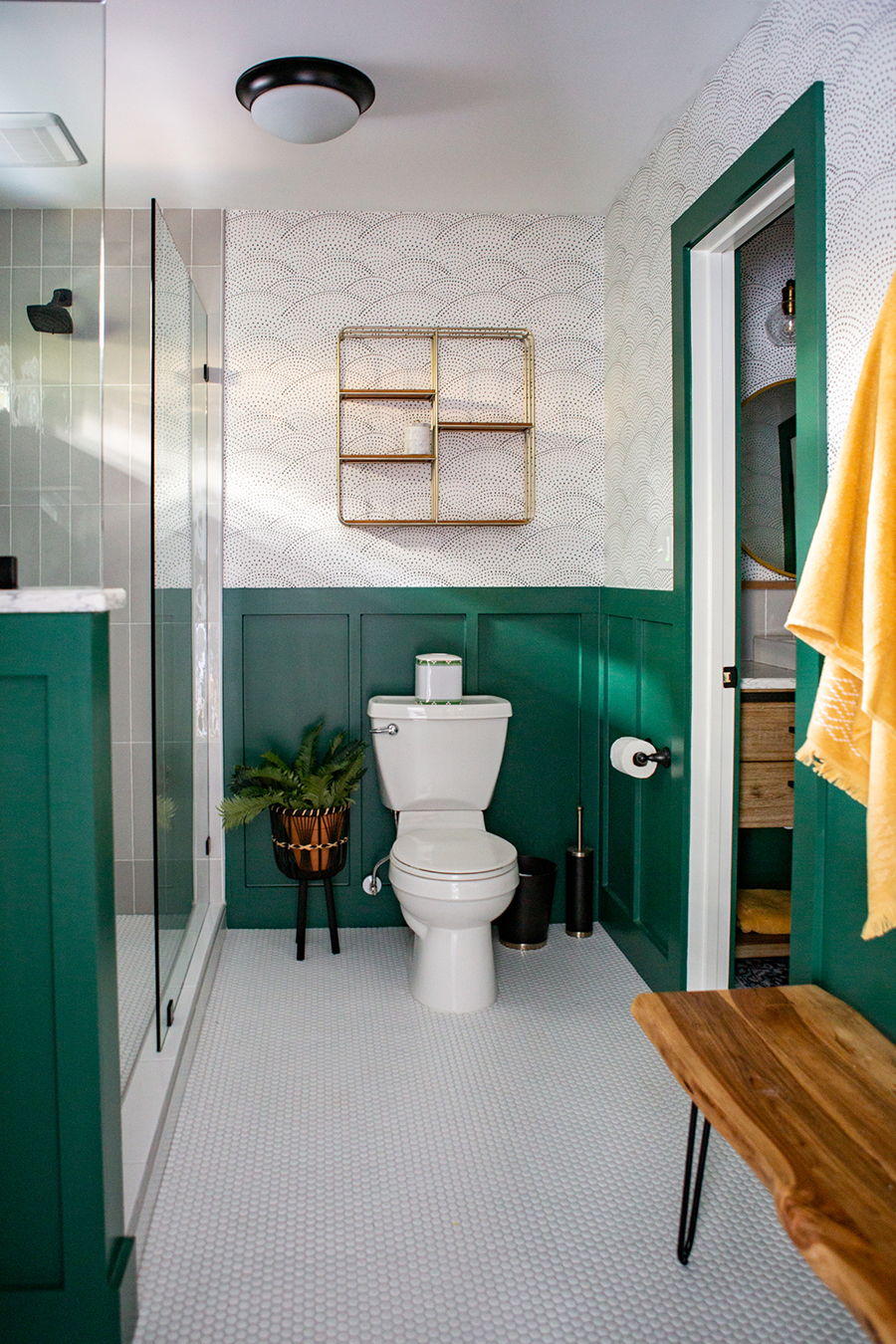
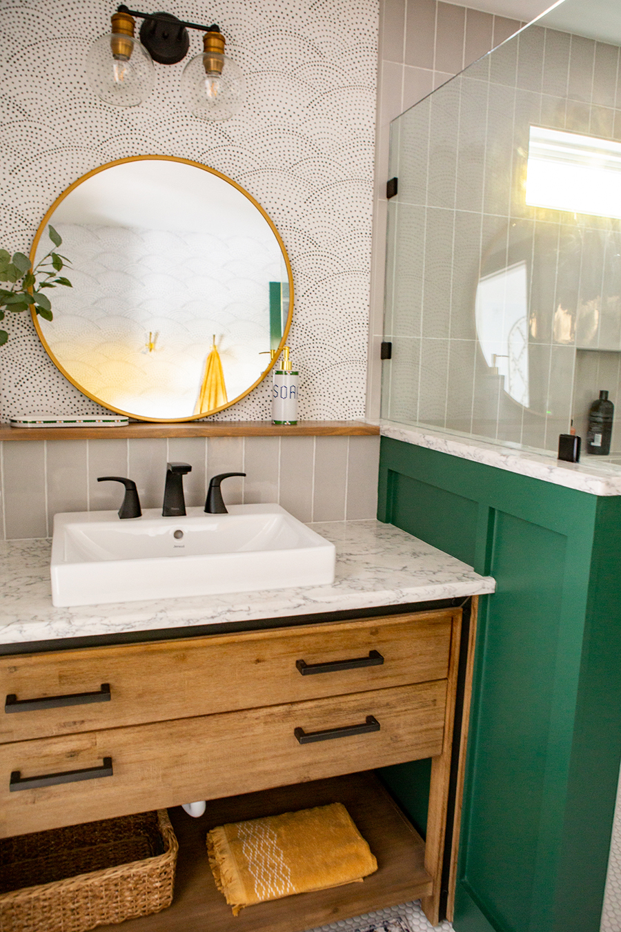
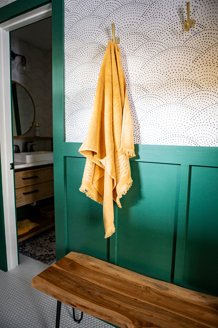
This bathroom by interior designer Abbey Susanne Richey is an emerald-green dream! The rich wainscoting adds tremendous character and interest to the space. Without the simple and chic wallpaper, however, it could have become overpowering. The grey dotted scallops build off the paint’s playfulness while offering a respite from its saturation. Polished neutral accents, like the shower’s sleek grey subway tile, white penny tile flooring and marble-and-wood vanity, round out the space with their timeless sophistication.
 |  |  |
| Design and Photography by Interior Designer Abbey Susanne Richey | ||
Has this style round-up inspired you to find the balance between maximalist flair and airy minimalist design in your own home? Tell us how you’d style your space in the comments below, or tag A-Street Prints in your photos on Instagram!
